
Colour Psychology To Help Sell Your House
We cannot imagine our world without colours. Every colour will affect us differently. Various research look at how colour psychology influences people’s behaviour.
This research is not solely for academic purposes either. Clever marketers focus on the impact colours have on people and base their designs with colour psychology in mind.
Let’s have a closer look at how different colours affect us and see if there are any particular colours to consider when painting the walls of a house before putting it on the market – credit to www.howstuffworks.com
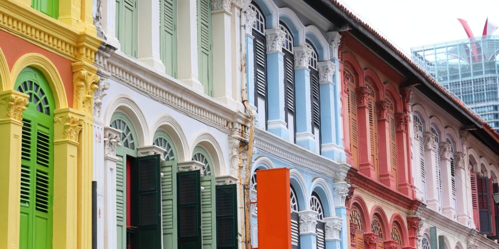
- Red: Red is the colour most people have the strongest associations with, and reactions to. People frequently report feelings of strength, courage, aggression and excitement. Red can elicit an increased heart rate and energy level, and just a dash of red on something can really draw someone’s attention. Whether it’s a stop sign, a Valentine’s day card or a warning label, red is there to catch the eye.
- Orange: Orange can spark some serious reactions too. It is like marmite – you either love it or hate it. Orange is often linked with flamboyance, energy, comfort and warmth.
- Yellow: Yellow can be a happy, cheerful colour. People often report feelings such as enthusiasm, energy, excitement and optimism when viewing it. In some shades and amounts, yellow is believed to be mentally and creatively stimulating, but in others it can be associated with cowardice, fear and anxiety.
- Green: Green is a colour commonly used in expressions and symbolic associations. This is the second to blue as a favourite colour for many people. Natural shades of green can feel refreshing, balanced and soothing, but other shades of green can invoke sickly, bland or slimy feelings. Green is often symbolic of concepts like peace, envy, luck and fertility.
- Blue: Blue is favourite for the most of people. This is because this colour can actually trigger the body to produce calming chemicals. Blue frequently invokes words like dependable, loyal, logical, soothing, calm and focused, although some shades can bring feelings that are more dynamic and exhilarating, or cold and distant. Blue also tends to increase worker and athlete productivity.
- Purple: Purple is the balance between the liveliness of red and the serenity of blue, so some uncertain shades of purples can leave people feeling a little uneasy or introspective. Others can invoke feelings of loyalty, quality, mysticism and wisdom.
- Black: Black is a powerful colour, often bringing to mind authoritativeness and other strong, sometimes overwhelming, emotions. Black can be associated with grieving in the Western hemisphere, but head East and the colour white makes people think of mourning.
- Brown: Brown often conjures up feelings of stability and naturalness. People commonly report experiencing sensations of reliability when they see brown and a sense of order and wholesomeness.
These are the main basic colours. We see various shades which vary from each other by the saturation and intensity. When deciding the right shade for the house you sell, the choice is great, and colour psychology can definitely be the key factor in the success of your home’s sale. One of the best courses of action you can take when selling your house is to apply a fresh coat of paint before putting your home on the market.
Let’s have a look at the impact of various colours on potential home buyers. First comes exterior – it should be appealing to as many of potential buyers as possible, and this should be your goal.
A very good idea is to look at your neighbourhood when choosing exterior colours so the house on sale can blend well with the general colour scheme of the neighbouring houses. One poorly painted house can ruin the value of homes in the whole street.
Take a look at the most popular colours which would make your home stand out in the property market:
White, Gray, Blue, Tan/Brown, Cream, Beige, Green, Yellow, Red
We deliberately put bright colours in the bottom of the list. There are several reasons for this:
- The muted neutrals usually convey the message that the house is bright, clean and spacious
- Light, neutral shades help the house appear new and fresh
- Finally, light colours are less likely to fade over time
You have more freedom when deciding the colour for the trim, shutters and doors. Choosing the neutral hues is still safe, but bright blues and reds work really well, particularly on the front door – a bright welcoming colour can make a favourable impression on possible home buyers.
Then comes the interior. We recommend to apply the same principles as for the exterior – light neutral colours make rooms look light and spacious – off-white is our top choice. With a primer, it can cover any dirt, stains and out of style colours that need concealing.
If painting all the interior areas is not an option, focus on the first room potential home buyers will see, any problem areas and smaller rooms, which could benefit from a size-enhancing coat of paint. Spending on paint may seem as an unnecessary expense, but trust us the pay off will be worth it. Let your potential buyers know when the new paint job took place, as well as the quality of paint used. This may become one of the selling point when your house is on the market.